Blog Series Recap
Part 1 (click here to read): How I became acquainted with Dr. Lawlor’s robotics experiments at UAF.
Part 2 (click here to read): Writing a C++ script to collect data from the robot and insert it into the PostreSQL database.
Visualizing the Collected Data
With data propagating into our database, we can turn our attention to getting a visual display.
Choosing the Tools
The first task was simply to choose the proper tools. We researched through a dozen different options, and even tried using some of the native visualization tools of C++ and Qt.
However, those routes proved to be ineffective.
In the end, we came to the tools I studied in my Udacity Data Analytics Nanodegree. These include Jupyter Notebook, Matplotlib, and Pandas. I also added the SQLAlchemy module to the mix, to make it easier to process the SQL database content.
Jupyter Notebook Breakdown
The Jupyter Notebook has a step by step approach to visualizing the data.
The first step is to initialize itself and connect to the database.
Then we declare the functions that allow the notebook to retrieve data from the database and convert it into a Pandas dataframe.
Finally, using a function that repeats itself endlessly, the program grabs data from the database and draws it on a graph. Every half second or so, this graph updates with the most recent database entries, allowing for live representation.
An Explanation of the Two Graphs
Note the two graphs in the above content.
The top graph displays the power level of the motors. The y axis shows the percentage of power sent to the motors. A positive value indicates that the motor is pushing upwards, and a negative value indicates downwards.
The bottom graph shows the actual angle of the tool. The y axis represents the angle in degree units.
The x axis of both graphs represents the database entry number for each plot point. They proceed in a sequential fashion, so they serve as a simple method for visualizing a time-based series.
Here is a screenshot from my computer as I created this live graph.
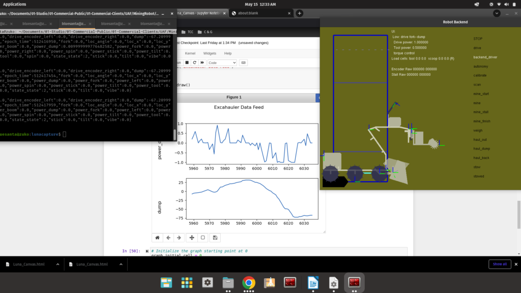
On the right you can see a stylized picture of our robot. One of the tools on the robots is moving back and forth as I click the left and right keys on my keyboard, and the graphs in the Jupyter Notebook display the recorded data from these actions.
Coming Up: Connecting to the Robot Itself
I’m excited to show you the next step in this series. We succeeded today in connecting my database and my live graphs with our robot.
2 comments
Comments are closed.